Find a data visualization (static dashboard, chart, map, etc.) that you discovered in the past few weeks.:
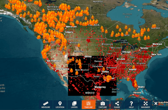
“A wildfire map available through the National Interagency Fire Center, which presents much of its data in a graphic, map-based format. Image: NASA/Fire Information for Resource Management System.” – https://www.sej.org/publications/reporters-toolbox/top-data-sources-can-help-cover-larger-wildfire-story
Your judgment: was it created by a human designer or generated by AI? Explain your reasoning.:
I believe that this map was created by a human designer and not generated by AI. The standardized geographic boundaries, precise fire markers, and interactive tools reflect established GIS and cartographic practices developed by human designers for analysis and decision-making. While AI may assist in detecting or processing wildfire data, the map itself is a purpose-built, data-driven visualization curated by people.

Leave a reply to sydneyclaudio Cancel reply